The National Center for Science and Engineering Statistics (NCSES), housed within the National Science Foundation (NSF), recently launched a new “Indicators Explorer” data visualization tool that allows users to quickly build line, bar, and column charts as well as various maps and other graphics from within the Indicators platform. The tool draws on 28 indicators across topics pertinent to S&E such as patents, research publications, R&D expenditures, and the STEM workforce; a full list is available here. NSF expects to update the tool periodically with new indicators and data.
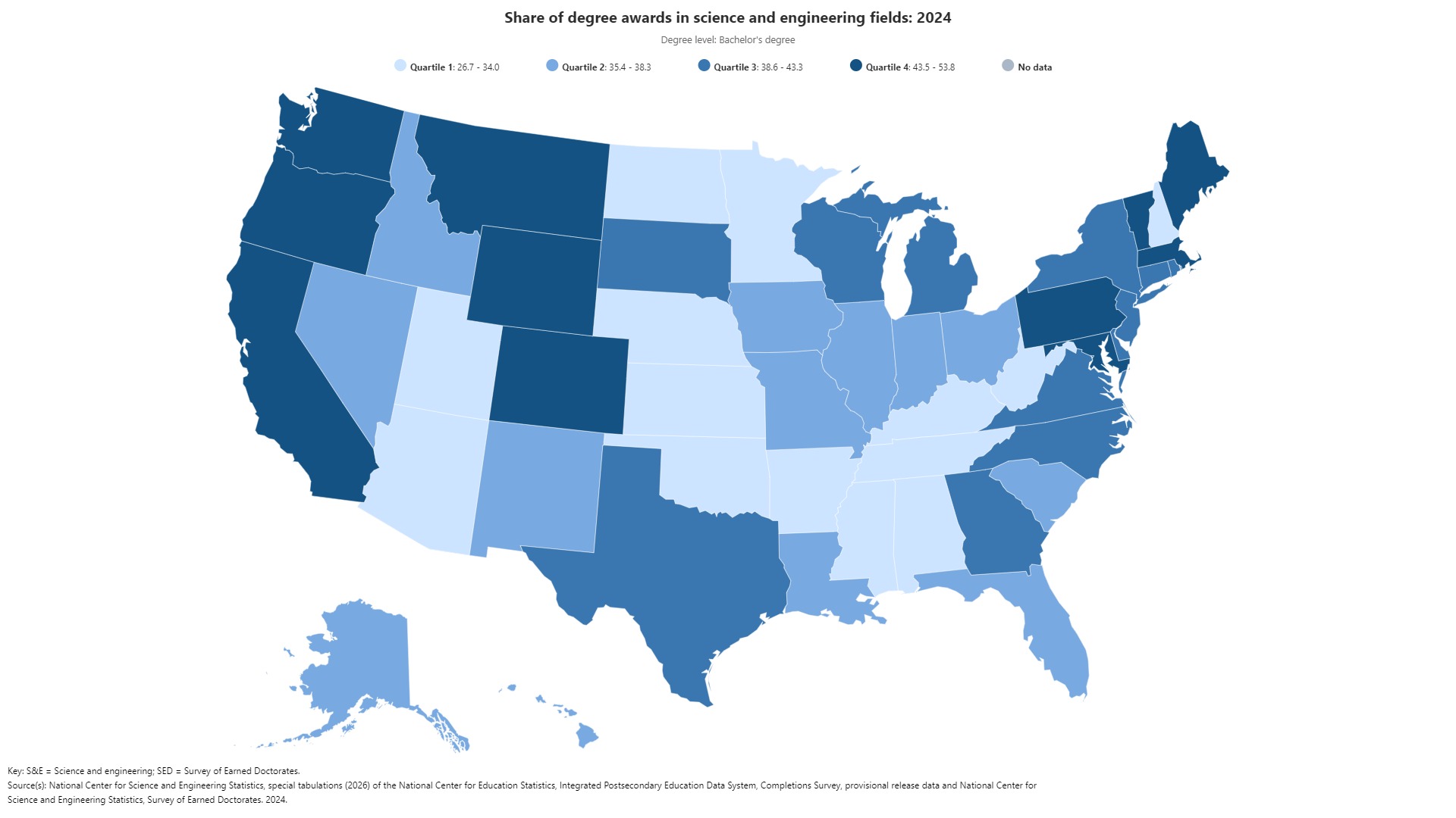
As an example of the Indicators Explorer tool in action, users can navigate to the tool’s home page, then type “S&E Degrees by State” and click on the indicator to instantly see a state-level map of the share of bachelor’s degree awards in S&E fields for 2024 broken down into four quartiles. From there, users can click “customize map” to toggle the degree level to Doctoral or to remove jurisdictions from the map. In the top right of the map, users can also click to share (retaining all modifications) or download an image (JPEG, PNG, or PDF) or table (CSV) of the graphic.
The CSV file includes columns for the year, state, FIPS code, degree level, and value, making it convenient to use in separate data visualization software if needed.
Below is an image generated directly from the Indicators Explorer platform for the example above, “S&E Degrees by State,” with no edits or modifications.